Word documents
Creating accessible documents and forms is easy when you prioritise accessibility from the beginning. This page sets out how to create accessible Microsoft Word documents from the start.
NSW Government prefers HTML content
When publishing content on the web, the NSW Government prioritises HTML. This means publishing content on our websites rather than using PDFs or Word documents. HTML content works better for most users, especially assistive tech users. Content under four pages should be published in HTML by default, without any alternative format.
Consider which format you should use for your documents, based on your users’ needs. Only use PDFs if no other format will work, as set out in the Australian Government Style Manual.
Make sure your document adheres to the NSW Government branding guidelines. This ensures consistency across communications for all NSW Government departments, agencies and entities.
Microsoft Word documents
Use these key principles to help you create accessible Word documents.
- Structure your document with headings. Use heading styles (Heading 1, Heading 2, etc.) for a clear and organised document structure.
- Use Word’s built in heading styles. Avoid manually formatting heading text.
- Check that your document has a logical reading order using the 'Read Aloud' or 'Check Accessibility’ feature with the Microsoft Word ‘Review’ tab. This helps ensure your document can be navigated using a keyboard.
- Add descriptive alt text to all images, charts, and graphs. Right-click on the image, choose 'Edit/View Alt Text' and describe the image. Alt text ensures that individuals with disabilities can access and understand the content of non-text elements such as images, charts, graphs, diagrams, and icons.
- Some images are decorative or don't convey essential information. Mark these images as ‘decorative’. Right-click on the image, choose 'Edit Alt Text' and click ‘descriptive’.
- Text is only readable if it stands out from the background. Ensure that the contrast between text and background in images is sufficient for readability. Visit colour contrast for more information.
Tables are for presenting data, not for changing aesthetic layouts. Some data can be shown through a list or regular text.
Only use a table if there's no easier way to show your information.
If you are using table, you can improve its readability by using these settings:
Add a descriptive title
- Place the cursor on the table.
- Go to the 'Table Design' tab (you may need to select the table first).
- In the 'Table Style Options' group, check 'Header Row' and 'Total Row' if applicable.
- Enter a clear and concise title and description within the table's properties. This title should describe the purpose or content of the table and the description should give detailed information of the table's contents. Right click the table, select ‘Table properties’, choose ‘Alt text’ and enter the ‘Title’ and ‘Description’ fields. This helps your readers understand what the table represents.
Use header rows
- Ensure the first row of your table is set as the header row.
- Check that 'Header Row' is selected, under 'Table Design'.
- This helps screen readers identify column headers.
Avoid merged and split cells
- Minimise the use of merged or split cells.
- Screen readers may have difficulty interpreting these differently formatted cells.
Use simple formatting
- Avoid complex formatting within the table, such as nested tables or multi-level structures.
- Screen readers may have difficulty interpreting complex table formatting.
Specify column headers
- If your table spans multiple pages, set up column headers to repeat at the top of each page where the table continues.
- This helps maintain context.
Check reading order
- Ensure the reading order of the table is logical.
- The order should be left-to-right and top-to-bottom, just like reading a book.
- This helps with keyboard navigation and ensures screen readers can navigate the table.
Visit creating accessible tables in Word for more information.
- Use descriptive link text that indicates the link's purpose or destination. Avoid using generic link text like 'click here.'
- Screen reader software sometimes jumps from link to link. Making sure the link text is descriptive ensures the screen reader user understands what each link is for.
- Ensure links are distinguishable through underlines or contrasting colors.
- Avoid writing out the full URL of a link. Instead, use meaningful anchor text for your link.
- Ensure download links are clearly marked with the file format of the download.
Like this
Visit our Accessibility and Inclusivity Toolkit for more information.
Not this
Click here to go to the toolkit.
- Choose readable fonts. Avoid overly decorative or cursive fonts.
- Maintain a clear contrast between text and background colors.
- Use bold, italics, or underlining sparingly for emphasis.
Visit typography for more information.
Colour plays an important role in creating documents. The NSW Branding guidelines include guidance on how to use colour effectively and accessibly.
For an accessible document that uses colour, choose pre-set colours and styles, especially if it's mostly text (e.g., black text on a white background). Visit colour contrast for accessibility advice for when using colours in documentation.
- Include a clear and concise table of contents, if applicable.
- Use page breaks and section breaks appropriately for readability and structure.
- Ensure keyboard navigation is possible, including via headings and links.
- Provide closed captions for videos.
- Include transcripts for audio content.
- Use accessible media players with playback controls.
Visit video and audio for more information.
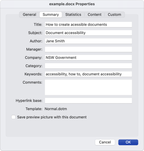
Complete the ‘Summary’ section of the document's properties.
- Set a meaningful document title, author information, keywords, subject and company at minimum.
- Set the document language to ensure accurate pronunciation by text-to-speech tools.

When naming a document, accessible document formatting is vital for inclusivity. For file names, opt for descriptive names like ‘accessibility-ambassadors-signup-sheet.docx’ instead of generic ones like ‘File123_v2.doc’. We recommend avoiding putting versions or dates within file names e.g., ‘v3’ or ‘october-2023’ as this could be confusing for the user.
Try to avoid
- Common words such as 'draft', 'letter', 'current' or 'active'.
- Unclear, vague or repetitive e-mail correspondence titles.
- Symbol characters such as: \ / < > | " ? [ ] ; = + & $ α β.
- Abbreviations that are not commonly understood.
- Dates if possible.
- Spaces, use a hyphen or underscore instead.
The accessibility checker scans your document, identifies issues, and provides information on how to fix them. Run this checker and ensure you fix all accessibility issues before saving your final document.

- Use Word's built-in 'Accessibility Checker' to identify and address accessibility issues (Review tab > Check Accessibility).
- Resolve any issues or errors reported by the Accessibility Checker.
Remember that the accessibility checker is an automated tool, which may not always offer suitable recommendations for your specific circumstances. Exercise your own judgement.
A widespread misconception is that Word documents cannot be locked to prevent editing, which often leads to the false assumption that PDFs are the only secure option. This couldn't be further from the truth. You can indeed lock Word documents to protect your content.
Microsoft Word for the web
You can restrict the editing of a document, so that the document opens in view-only mode.
- Select File > Info.
- Select Protect Document.
Microsoft Word newer versions
- Click Review > Protect > Protect document.
- A Password Protect pop-up should appear, with the ‘Protection’ section
- Check Protect document for: and select ‘Read-only’
- Click OK.
This will ensure your document cannot be edited only viewed.
Resources

‘Inaccessible documents are like death by a thousand paper cuts.’
— Accessibility NSW research participant
Support
If you need any assistance or have questions about the information on this page, please email us at digital.accessibility@customerservice.nsw.gov.au. To report an accessibility barrier with NSW Government’s online content, use our web accessibility report form.