Easy read
Easy Read is a user-friendly way to share information using a simple layout with text and images. Easy read can assist in providing information to people with intellectual disabilities and is also useful for people with English as a second language, older Australians, people with low literacy, and people with learning disabilities. The Easy Read writing style can make complex information easy to understand for all and lead to increased participation.
Example
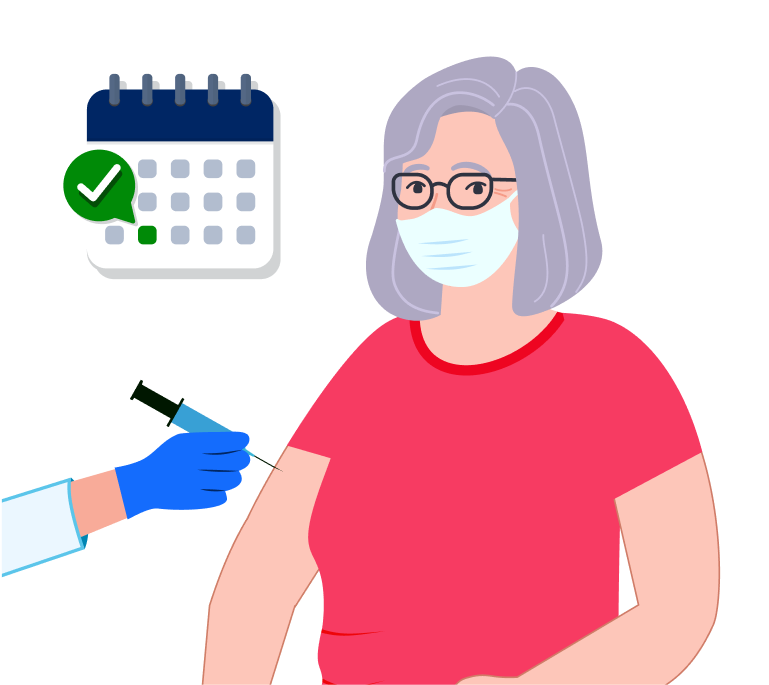
Image of an older woman getting a vaccination and the accompanying text.

Why Easy Read matters
Access to NSW Government information is essential to ensure all people in NSW have equitable access to NSW Government communications and resources. Easy Read helps everyone understand important government information, meaning people can make informed decisions.
Easy Read benefits everyone by simplifying information through plain language, short sentences, and clear messages.
When key government documents and pieces of information are only available in long form many people are unintentionally excluded from important information they need.
When to use Easy Read
People who could benefit from or prefer information in Easy Read access a wide variety of government services, not just services relating to disability.
Easy Read may be suitable for information or communications relating to:
- health services
- disability support services
- social housing
- education services
- public transport
- justice and family services
- completing a task, like filling out and submitting a form or application.
When considering whether to use Easy Read, check the preferences and requirements of your audience or users (this may include people with intellectual disability, people with English as a second language, older Australians, people with low literacy, and people with learning disabilities).
Consult with your audience and identify their needs, including:
- the services and information that are most relevant, for example accessing specialist disability services.
- information that is key to personal safety. For example, safety in an emergency or vaccinations.
- what information is needed for day-to-day life. For example, using public transport, social housing, dealing with fines, voting.
Easy Read format
Think of the Easy Read version as a short summary of the main ideas. This helps organise your document and decide how much detail to include. Use a consistent layout and minimal design elements. Use short sentences, one idea or point per sentence, and start each sentence on a new line. The simpler the better.
List the main points you want to talk about and plan how to explain them. Use examples to make ideas clearer.
Tips for writing Easy Read content
- Research how users access information—print, online, or with support.
- Check if Easy Read suits their preferences, or if other formats like video are better. Conduct research and usability testing to best understand users' preferences.
- Plan key messages before creating the content.
- Consider the purpose, audience, document use and timing.
- Treat Easy Read as a summary of source material to determine content and detail levels.
- Use examples and involve Easy Read experts in choosing relatable images images.
- Collaborate with experts who understand user groups and have design experience.
- Leverage their skills to connect language and imagery for effective communication.
- Maintain a consistent layout with wide margins, negative space, and at least 1.5 line spacing.
- Avoid tables, graphs or columns.
- Aim for no more than 20 pages. Keep content concise.
- Use page numbers on documents with more than 4 pages, page numbers should use the same font size as main text.
- Use a Public Sans font with a font size of at least 14pt or 19px.
- Don't use italics, underlining or write in all capital letters.
- Use bold for headings and difficult words. Visit typography for more information.
- Include relevant definitions on the first use of difficult words or concepts.
- Follow plain language principles, using simple words and sentences.
- Avoid jargon, slang, excess punctuation and unexplained acronyms.
- Use headings to breakup content into sections.
- Make the key messages clear, ensure people know the important information.
- Introduce your organisation, explain how to use the material, and reassure users.
- Include descriptive hyperlinks, word lists, and contact information for more clarity.
- Make Easy Read materials easy to find and available online as a webpage. If documents are required, accessible PDF or Word document formats alongside source materials are preferred.
- Ensure Easy Read materials go through a multi-stage review process involving self-review, peer review, usability testing, and a final quality review to maintain accessibility and effectiveness.
Images
While researching, think about the images you want to use. Some users find it easier to understand illustrations, others photographs. Be clear about who your audience is and how they relate and engage with the content. Ensure images have descriptive alt text.
Choosing images
- Be consistent with the style of image you use.
- The NSW Government Brand Toolbox offers image resources and stock image library suggestions.
- You can use good quality illustrations or photographs, but illustrations allow you to describe more in a less detailed way.
- When using illustrations, make sure they are simple, but descriptive enough to convey the meaning of one idea.
- Choose an image that describes the main points of the text or helps in understanding any more complicated keywords.
- Choose images that resonate with and are representative of your audience.
- Limit detailed background information that doesn’t help get the message across.
- Use well understood symbols like ticks and crosses to convey correct choices or actions.
Image formatting
- Images should be placed to the left of your text.
- Don’t put images above or below the text.
- Images should take up a third of the space and the related text should take up two thirds.
Complex language
Certain words might be hard for people to understand, especially those with three or more syllables.
Difficult words
If you have to use a difficult word, put it in bold. Right after, explain what the word means in simpler terms. If there are many of these difficult words, make a list at the end of your document and call it a 'word list.'
Example
Image of a chef chopping vegetables with accompanying text.

Avoid questions
Avoiding asking questions in your Easy Read text. Questions can make some people uneasy because they might feel pressured to respond. If you need information, provide examples after your questions so people understand how to answer.
Example
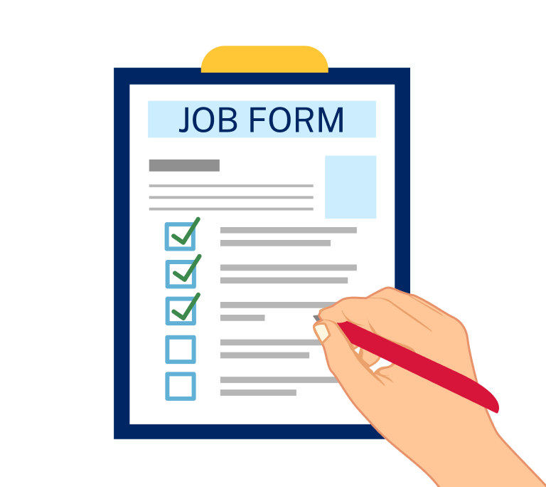
Illustration of a person filling out a form with text about employment.

Producing Easy Read materials
Try using our Easy Read tips or consider engaging with Easy Read experts, including for training or reviews.
Review
Your Easy Read materials should undergo a comprehensive review process to ensure their quality and accessibility.
This includes:
- self-review
- peer review based on Easy Read guidelines
- usability testing with an inclusive group, including people with intellectual disabilities, learning disabilities, low literacy and from culturally and linguistically diverse communities
- a final quality review.
Completing these review stages ensures your Easy Read material meets its purpose, adheres to guidelines, incorporates key messages, and maintains a logical flow. These factors are important to ensure your Easy Read content makes the information easier for people to understand.
Examples
Web Content Accessibility Guidelines
Support
If you need any assistance or have questions about the information on this page, please contact us at digital.accessibility@customerservice.nsw.gov.au. To report an accessibility barrier with NSW Government’s online content, use our web accessibility report form.