Colour contrast
Colour contrast affects how easily people can read your content both online and in print. This is particularly important for users with low vision or colour-blindness. By ensuring good colour contrast, all sighted users will be able to see your content regardless of their device or the lighting around them. The NSW Government Brand Toolbox will help you identify the approved colours and the NSW Design System provides technical components for the approved brand colours.
Contrast requirements
Colour contrast refers to the difference between foreground and background colours. To make content accessible, aim for a 4.5:1 ratio between the foreground and background colours. This ratio indicates how much one colour stands out from the other, like comparing their brightness or darkness. For large text, a 3:1 ratio is suggested, which means the difference in brightness between the two colours should be even more noticeable. With this ratio, people with moderately low vision can distinguish between colours and see their content.
Colour contrast issues may arise in:
- website templates or CSS that require developer attention
- digital and print documents, such as PDFs, magazines, Word documents etc.
- text within an image, such as infographics or event flyers
- using coloured text
- semi-transparent backgrounds or images with text
- comparison of link text with surrounding body text and background colour
- the colour of interactive elements, such as links and buttons.
Colour contrast can also be affected by typography choices, e.g., font size and weight. Text that is 24px or 19px bold can pass at a 3:1 ratio if it is large enough. A website's headings are usually the only large text.
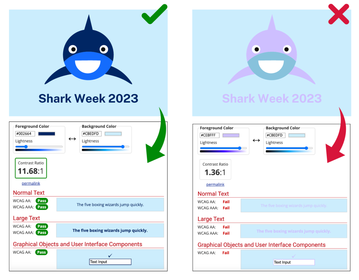
The image below compares examples of correct and incorrect use of colour contrast.

How to test
- Install the colour contrast checker Chrome Extension.
- Use the eyedropper or manually enter the text colour (e.g. a hex or RGB code) and the background colour into the colour contrast analyser.
- Check that the ratio meets the WCAG requirements above.
Testing tools
There are numerous online tools available to check colour contrast. Choose a tool that meets your needs.
Web Content Accessibility Guidelines success criteria
Support
If you need any assistance or have questions about the information on this page, please email us at digital.accessibility@customerservice.nsw.gov.au. To report an accessibility barrier with NSW Government’s online content, use our web accessibility report form.