Online forms
Online forms are a digital tool for collecting information from users. Users fill in fields like text boxes, checkboxes, and drop-down menus.
Creating accessible online forms is crucial to ensuring everyone can access and use them.
Developers can access the NSW Design System form component for technical information about how to create accessible online forms.
If you do not have the resources required to build an online form using the NSW Design System, Microsoft Forms is an alternative tool that can be used to create an online form without technical expertise.
Tips for creating accessible forms
Label form fields correctly
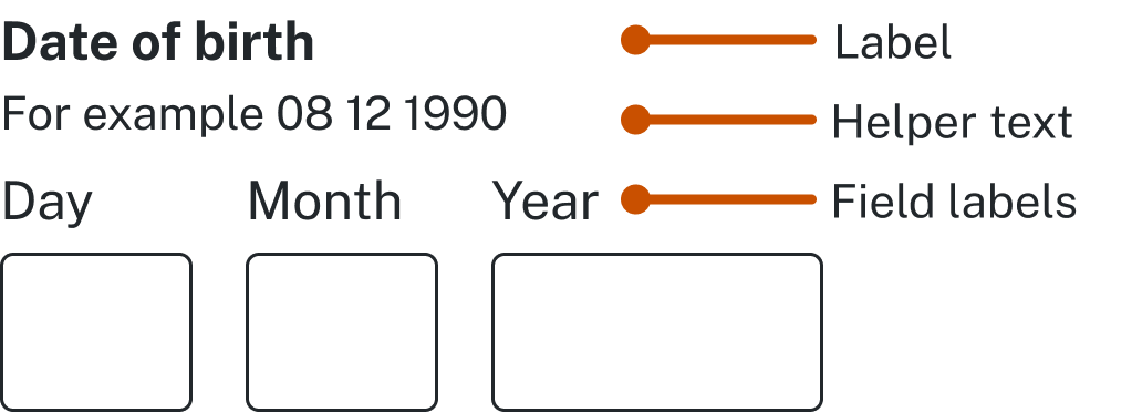
When designing your form, ensure that you use clear and concise labels for each field. This will help users to understand the purpose of each field and provide the correct information. Avoid using vague or ambiguous terms that may cause confusion and try to keep your labels short and straightforward.
To ensure that all users have access to the same information, it is essential to label form fields correctly by describing the role of each field on the form. While there are various techniques available to achieve this, it is recommended to use the label element, which is well-supported by assistive technologies. You can associate a label element and a form control with each other either explicitly or implicitly.
There are two ways to use the label element. One is by linking the label and the form field through a matching ID attribute. The other is by surrounding the form field with the label element.
Avoid using placeholder text in form fields
Placeholder text causes usability issues because it disappears when content is entered into the form field. Hints and instructions should be consistent and placed outside of the field.
Don’t use placeholder text to indicate what should go into a text field.

Do use helper text if required and always use a text field label.

Clearly define form field outlines
Make sure form fields have clearly defined borders or outlines so that people with cognitive disability know the size and location of the click target. Visit the NSW Design System to learn more about building accessible forms.
Ensure that your form is keyboard accessible
Many people with disabilities rely on keyboards to navigate websites and fill in forms. Therefore, it's essential to ensure that your form is keyboard accessible. Make sure that users can navigate through the form using the 'Tab’ key, and that they can easily select and submit their responses without using a mouse.
Use colour appropriately
Avoid using colour alone to convey meaning in your form, as this can be a problem for people with colour blindness. Instead, use a combination of colour and text to provide meaning. Ensure that there is enough contrast between the text and background colour to make it easy to read.
Divide long forms into smaller sections
Dividing long forms into smaller sections can reduce stress for users, particularly those with AD/HD. Long forms increase bounce rates and harm user engagement. Smaller sections make the information more manageable by presenting it in chunks that are less overwhelming and easier to understand.
For multi-step forms, apply these principles:
- repeat instructions on every page
- split the form into logical groups
- inform users of their progress
- provide the ability for a user to save their progress and return to the form later.
Test your form with assistive technologies
It’s important to test your form with assistive technologies to ensure that it's accessible to everyone. Use screen readers, voice recognition software, and other assistive technologies to test your form and make sure that it's easy to use and understand.
Error identification
Ensure clear feedback is provided to the user as to how to resolve the error, when errors occur when completing a form.
Reference: Understanding Success Criterion 3.3.1: Error Identification
How to test
Ensure clear feedback is provided to the user as to how to resolve the error, when errors occur when completing a form.
- Submit a form or a transaction with mistakes in it.
- Check the feedback provided to the user clearly explains:
- where the errors are
- what the error is
- how to fix the error.
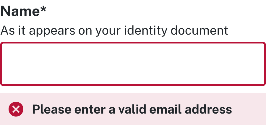
Don’t use colour alone to indicate an error
Example: Incorrect error identification

Do use an icon and explanation text
Example: Correct error identification

Resources

‘A lot of people ask why, when they should be asking why not.’
— Accessibility NSW research participant
Support
If you need any assistance or have questions about the information on this page, please email us at digital.accessibility@customerservice.nsw.gov.au. To report an accessibility barrier with NSW Government’s online content, use our web accessibility report form.