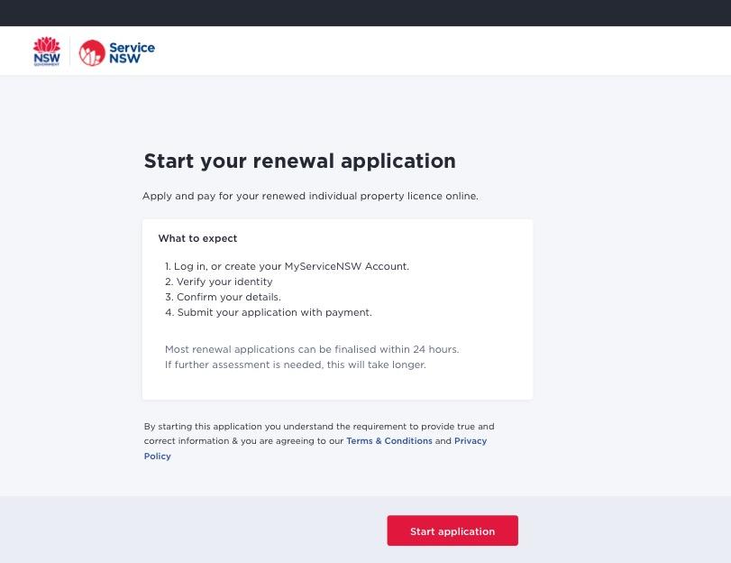
Map the transaction
The start of the transaction gives the user a map – the steps to take, and what to expect afterwards.
Context
The purpose of this page is to take users out of the main website and lead them into the secure transaction environment to log in.
The user arrives at this page ready to start the transaction. To get here they will have clicked on a call-to-action button such as 'apply online' on the website's landing page.
Guide
- Give users a succinct map for what happens in the transaction, and what to expect afterwards.
- The user arrives here ready to 'go'. Make the information easy enough for users to consume so they can start right away.
- Complement the previous landing page:
- reiterate crucial information
- tell users what documentation they will need
- map the transaction steps.
- Collaborate with your product team and stakeholders to confirm the order of content.
- Be as transparent as possible.
- Highlight important information. For example, when a user must finish a transaction at a service centre (not online), make this clear. Use headings, supporting copy or a highlighted box.
- Have a clear call-to-action button: 'start application'.
Rationale
Based on usability testing:
- users skip through this page as fast as possible – they arrive with the mindset of 'let's start now'. Make sure it's succinct and easy to understand – particularly on mobile
- users scan for information that reiterates their expectations
- setting user expectations increases transparency and their positive feelings around starting the transaction.
For example
'Most renewals can be finalised in 24 hours.''After you've sent your application, you'll receive an email confirmation.''After submitting your application, you'll receive SMS updates.'
