Confirm and wrap up
Let the user know what they've done, and what they can expect.
Context
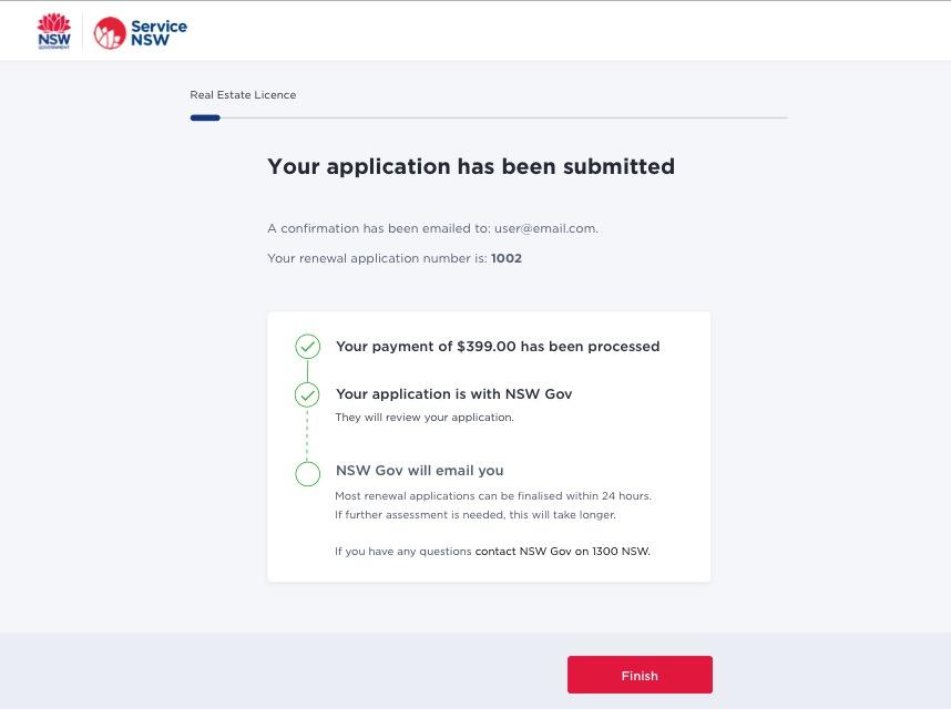
The purpose of the confirmation screen is to let the user know they have submitted their application, and what they can expect next.
The user arrives at this page after 'submitting' their application. It is the last screen they will see before they exit.
Guide
- Structure the page with the most important information at the top.
- Keep the language factual. Avoid using 'successfully submitted', as this can raise expectations.
- Use words like: submitted, confirmed, received, sent.
- Confirm what the user has completed. For example, confirm they've finished the transaction, and their payment has been processed.
- If you are also sending a receipt to an email, reinstate the email address.
- Highlight what the user can expect next. If possible, provide a timeline for when they can expect the outcome of their transaction.
- If possible, provide the relevant contact details.
- If possible, let the user know how you will contact them after their transaction has been processed. This will be via email, SMS, phone or postage.
Rationale
Usability testing has shown that a simple and clear confirmation page has a positive impact on users.
This page lets the user know what they've completed, what they can expect next and where to go for more information.
It's best practice to include this information, particularly when you are collecting a user's personal data and payment.
It adds a sense of finality to the entire transaction process.
Example
