When we explore the web, we're often immersed in a world of colours and visual elements. While these design choices can be aesthetically pleasing, they also play a significant role in determining the accessibility of the content we’re viewing. One key aspect of this is colour contrast, which refers to the difference between foreground and background colours.
Imagine trying to read a book with pale grey text on a slightly lighter grey background. Frustrating, right? Now, think of a scenario where a person with a visual impairment encounters a similar situation on a website. Proper colour contrast ensures that text and visual elements stand out clearly from their background, making content readable and understandable for everyone.
Everyone who can see, sees things in different ways
For users with colour blindness or low vision, perceiving certain colour combinations can be a challenge. In such cases, sufficient contrast between text and background helps in distinguishing content elements. It's also important to note that using high contrast colours doesn't just aid those with vision impairments; it benefits everyone, including people using small screens in bright sunlight or those with aging eyes.
Colour also plays a vital role in conveying information
Colour contrast isn't only about text; it extends to all visual elements, including buttons, icons, and graphics. If interactive elements don't have proper contrast, users might struggle to identify clickable areas, impacting navigation and interaction. A simple call-to-action button, like ‘Read more’ or ‘Next Page,’ can become ineffective if its colour doesn't stand out against its surroundings.
Think about error messages highlighted in red or links shown in blue. These color-coded cues quickly communicate important actions or feedback. But if the colour contrast isn't adequate, these cues lose their effectiveness, leaving users confused or unaware of critical information.
How to test colour contrast
Web Content Accessibility Guidelines (WCAG): Use of colour provides standards for creating accessible digital content. One of the key criteria is ensuring a minimum colour contrast ratio. The most referred ratio is 4.5:1 for normal text (this ratio means how much one colour stands out from the other. It's like comparing their brightness or darkness) and 3:1 for large text (this ratio means that the difference in brightness between the two colours needs to be even more noticeable). This ensures that even people with varying levels of visual acuity can distinguish content. Adhering to these guidelines means embracing inclusivity and making digital spaces welcoming for everyone.
As designers, developers, and content creators, it's our responsibility to consider colour contrast from the outset of the design process. This can save time and effort compared to fixing accessibility issues later. Thankfully, there are numerous online tools and colour contrast checkers available online to help us ensure that our designs are accessible to everyone.
Testing tools
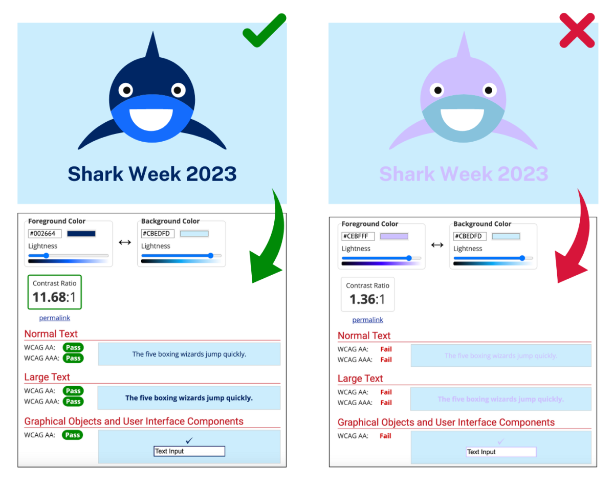
The image below compares examples of correct and incorrect use of colour contrast.

For more information on creating content that everyone can use, check out the Accessibility and Inclusivity Toolkit. Within it, you can find the resources, tools, and training needed to help you meet accessibility guidelines and ensure that your products and services are accessible to everyone, regardless of abilities.