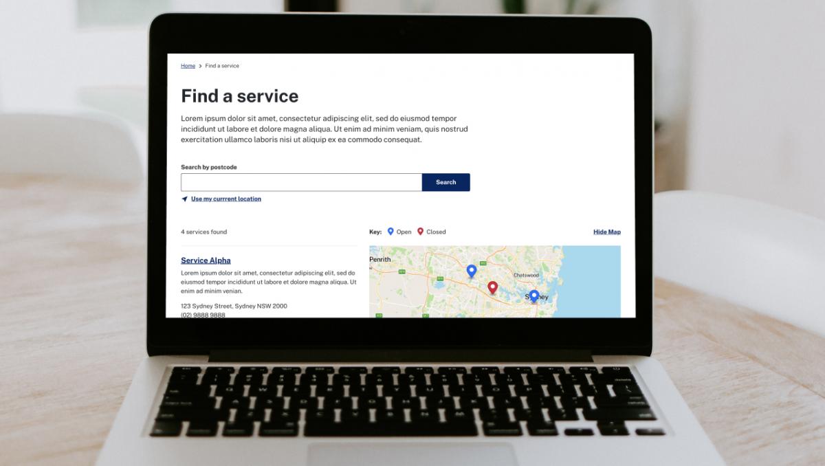
Our peers in digital teams across the sector have come together to give you a series of pointers about how to make great map experiences!
Design System version 3 now includes methods and Maps is one of the first methods added. The maps method has been curated as a shared resource for teams across NSW to start implementing, adapting and extending.
As well as a core set of styling and design decisions to align with the new Maps method gives guidance on how you can achieve consistent interaction patterns so that your users are familiar and confident in using the map on your site, even if the map they've used before is made by another team.
We've also created three example page layouts you may want to consider, which show how the Design System components work alongside the new Maps methods for common use case scenarios you may be building in to your website or service.
Why add maps to the Design System?
There's hundreds of maps in use for government services on the various NSW websites our customers use. Government websites provide maps to help with tasks like finding a preschool for your child, looking up petrol prices at service centres near you, or finding camping grounds that are pet friendly. With an increasing number of ways maps are used we're seeing inconsistent practices and implementations among teams.
Our vision for the experience across all Government sites is to have a few common elements regardless of which website or the underlying mapping solution a digital team has used.
- The pins and markers used will be consistent, on brand, and have good colour contrast
- The fonts will create clear visual hierarchy and be on brand
- Results will be delivered in an informative and accessible format
- The base layers are of a high quality, and use a colour scheme that works alongside brand colours
- And most importantly, consistent interaction patterns make it easier for users to adapt to different map experiences whichever part of Government they're dealing with.
It means you can get an accessible and brand compliant way of presenting map UI elements but can implement it using the tool of your choice.
What we did
The new Maps method is a great example of our community shaping a new brand-compliant pre-made component in the NSW Design System - it's a method that began as a discussion in January, with great contributions from Alice, Adham and Jennifer on the Digital.NSW Community. It's also been built with reference to the nsw.gov.au website, and National Parks and Wildlife Services who have some great map-based interfaces.

How to implement
In the Design System documentation we've got an example of how this works using MapBox. You're welcome to use this - but it's not the only way. The approach hasn't produced yet another map tool, but instead it's giving teams flexible implementation rules that can be applied on the solution they're already have in place.
We're also working with Spatial Services NSW who already provide a more fully featured mapping solution Spatial Map Viewer. If you're looking for a more sophisticated mapping solution, Spatial provide their solution as a service to NSW Government teams, so get in touch with them about their support offerings and fees.
We're continuing to work with the Spatial Services team on ideas for what comes next so we'll keep you posted as this work progresses!
Join the community
If you have thoughts or feedback on how we support teams implementing maps get in touch with the Design System team. You can also share your thoughts with us on the digital.nsw Community.